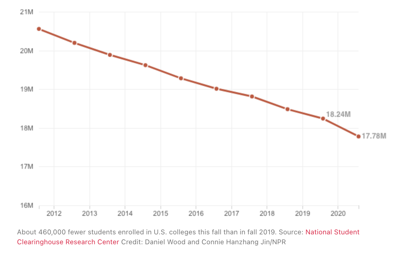
I worked with my team on a multi-year project to update Temple’s undergraduate admissions site (2018-2021). This involved migrating the admissions site to a new version of Drupal, and then holistically updating the content, design and information architecture based on current research into both prospective student/family mindset and user behavior. Given declining enrollment numbers across higher education industry during the pandemic and even before, this project was high priority for the our admissions team and our university partners.
- My role: Primary UX support—research, information architecture, process design; content migration
- The team: Developers, UX, visual design, content managers.
- Stakeholders: Temple’s admissions team and leadership, prospective students and families, current students
Step 1: Transition the site to a modern CMS and give it a refresh
As a member of the web content team at the time, I spearheaded this project, handling image gathering and preparation, and content migration along with continuing to manage factual updates of the site manually, both on the legacy and development sites.
Step 2: Research throughout
One of our main goals was to incorporate research throughout the site development process. The folks developing content were on board with this and loved having the context that the research provided—this was a new way of integrating UX/research and content writing in the department, and we were happy with the results.
Some research Inputs: Primary user research, UX best practices, third party research on specific audiences who would be looking at the site (transfer students, first-year students, international students, parents and families)
Baseline UX + Audience Research
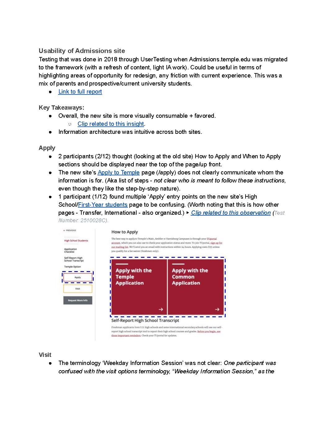
We did some initial comparative testing with the dev site in 2018 when the site was transferred to a new platform. I compiled these into a report and shared it with the content team, highlighting problems and areas for improvement. We learned things about jargon that participants didn’t understand and tailoring content to specific groups of viewers (transfer students, international, etc)
In addition, we gathered basic insights on each topic from our library of user research studies and third party research, boiled them into “one-pagers” with key takeaways for each audience, and presented these to the content team to help them empathize with the people they would be writing for.
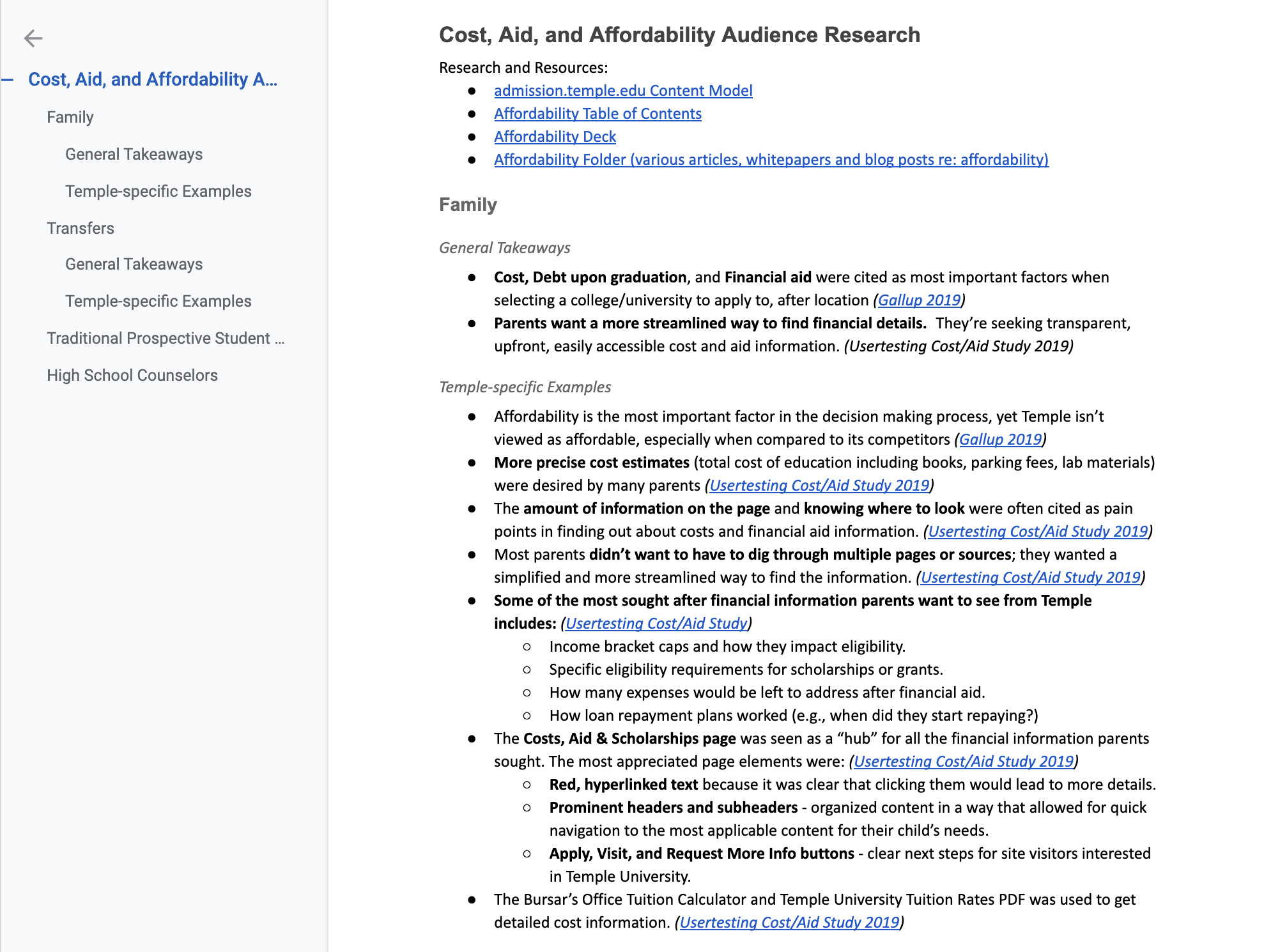
Cost and Affordability: research proof points
We relied on research to negotiate a number of questions with the client. The research team had done several UserTesting studies with prospective parents and students around the costs of paying for college—their main questions, concerns and information expectations. Our main takeaway was that people were stressed and overwhelmed, especially at the beginning of the college process and needed transparent, easy-to-follow information.
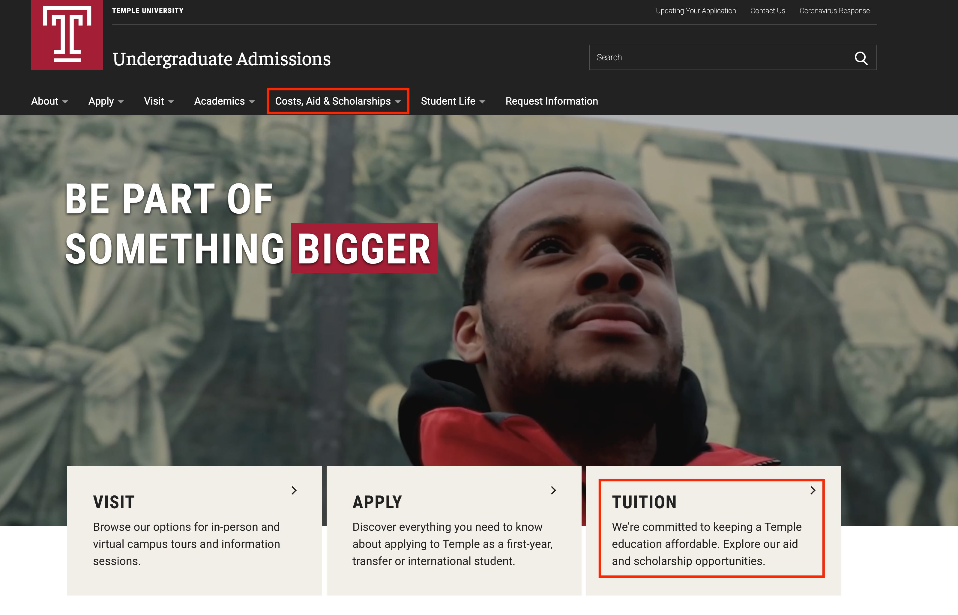
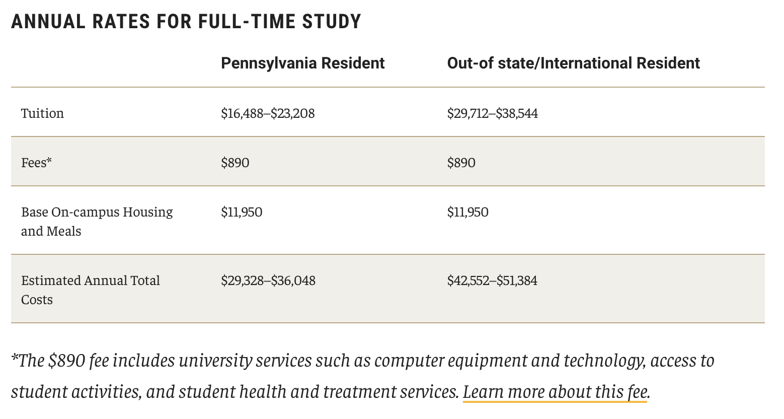
In the original version of the site, costs were buried because of the complicated cost structure for each school. Members of the Admission team were afraid it would be a turn-off for prospects to see actual tuition data on the page. We proved otherwise by showing them the video clips of parents navigating cost pages and complaining about the difficulty of finding tuition information, including the desire for granular information on housing and fees. With this research, we were eventually able to get the whole team on board, in making sure the information itself was thorough, transparent, and easy to find on the site.
Step 3: Information Architecture
We wanted to reconsider the information architecture (IA) based on user research, surfacing the content most needed by prospective students/families and making it easier for admissions counselors to use the site as a recruiting tool.
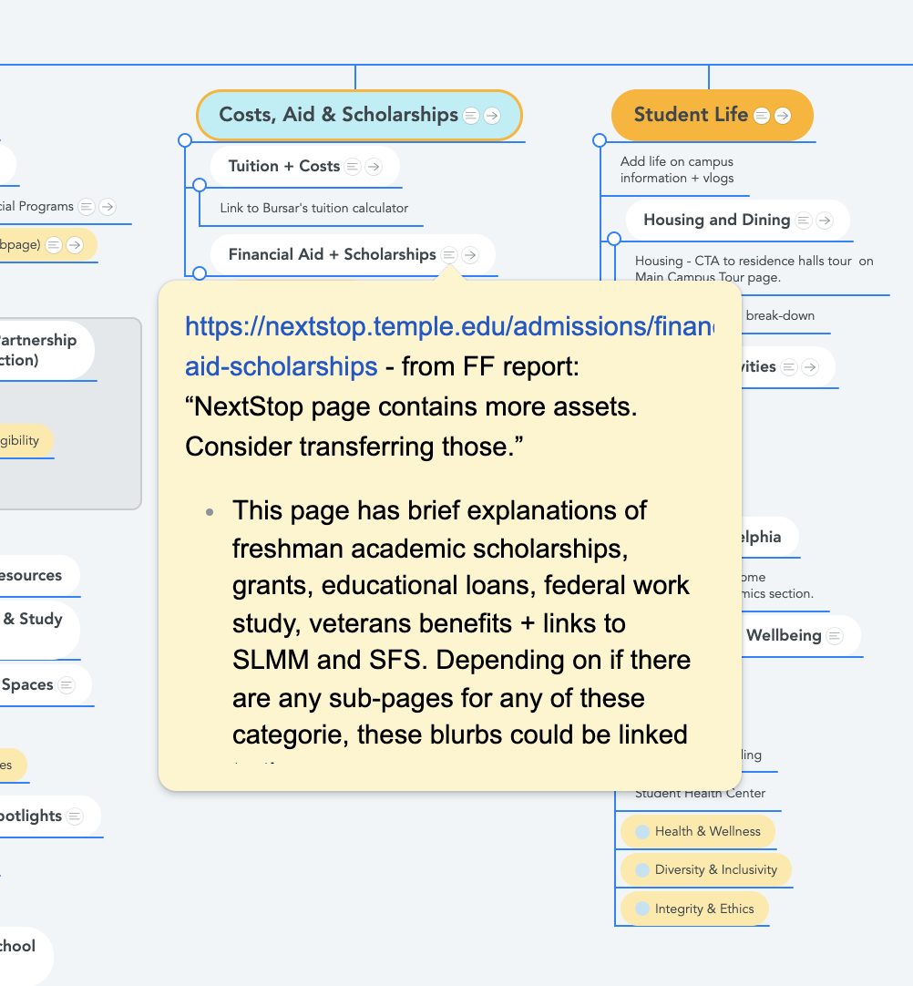
Creating a site map
To get everyone on the same page and “wrap our arms” around the content, I facilitated several post-it sessions to map out the architecture and content topics. UX, project management and content team members participated.
When we felt the map was in a good spot, I translated it to a mind mapping document so that it could be easily referenced and updated throughout the process. We included on-page content topics, notes and questions to think about as well as representing the page structure.
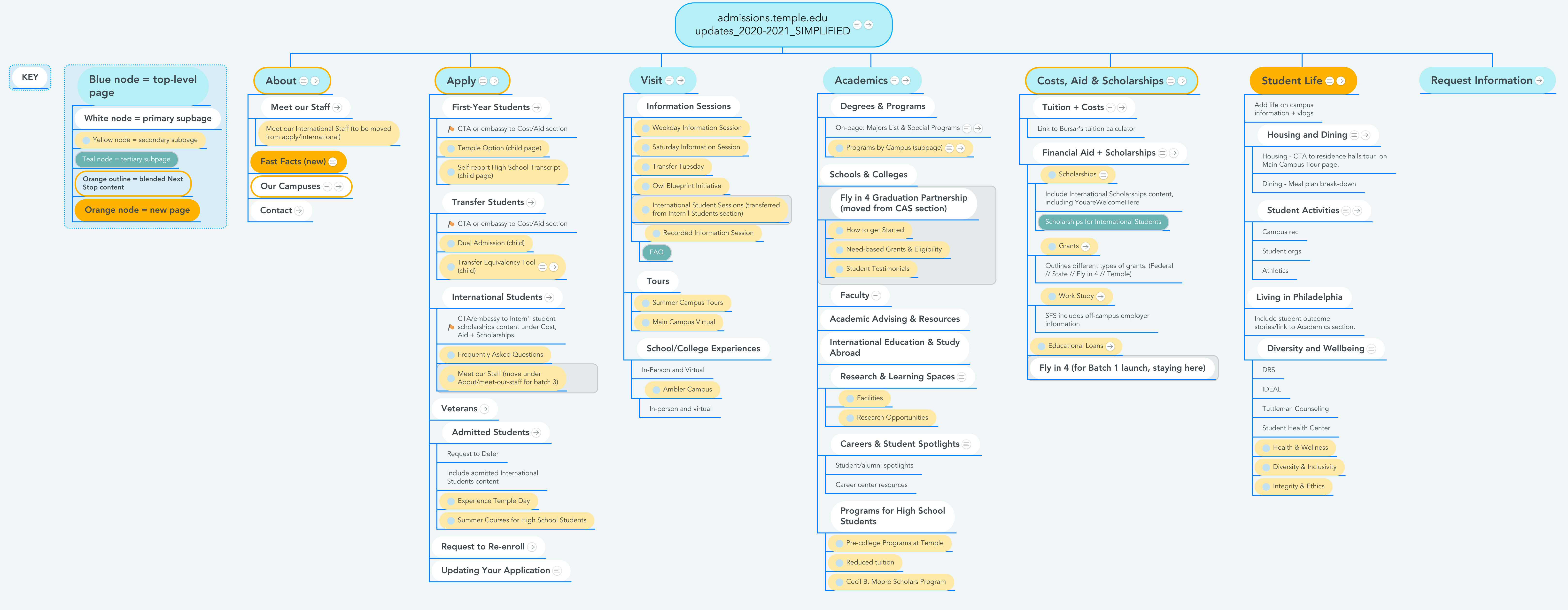
Step 4: Drilling down: content models and templates
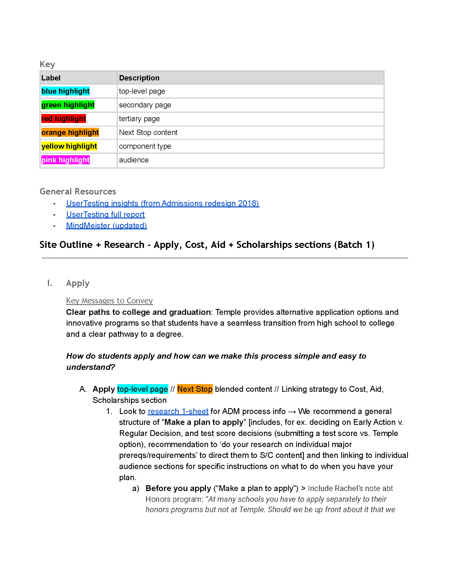
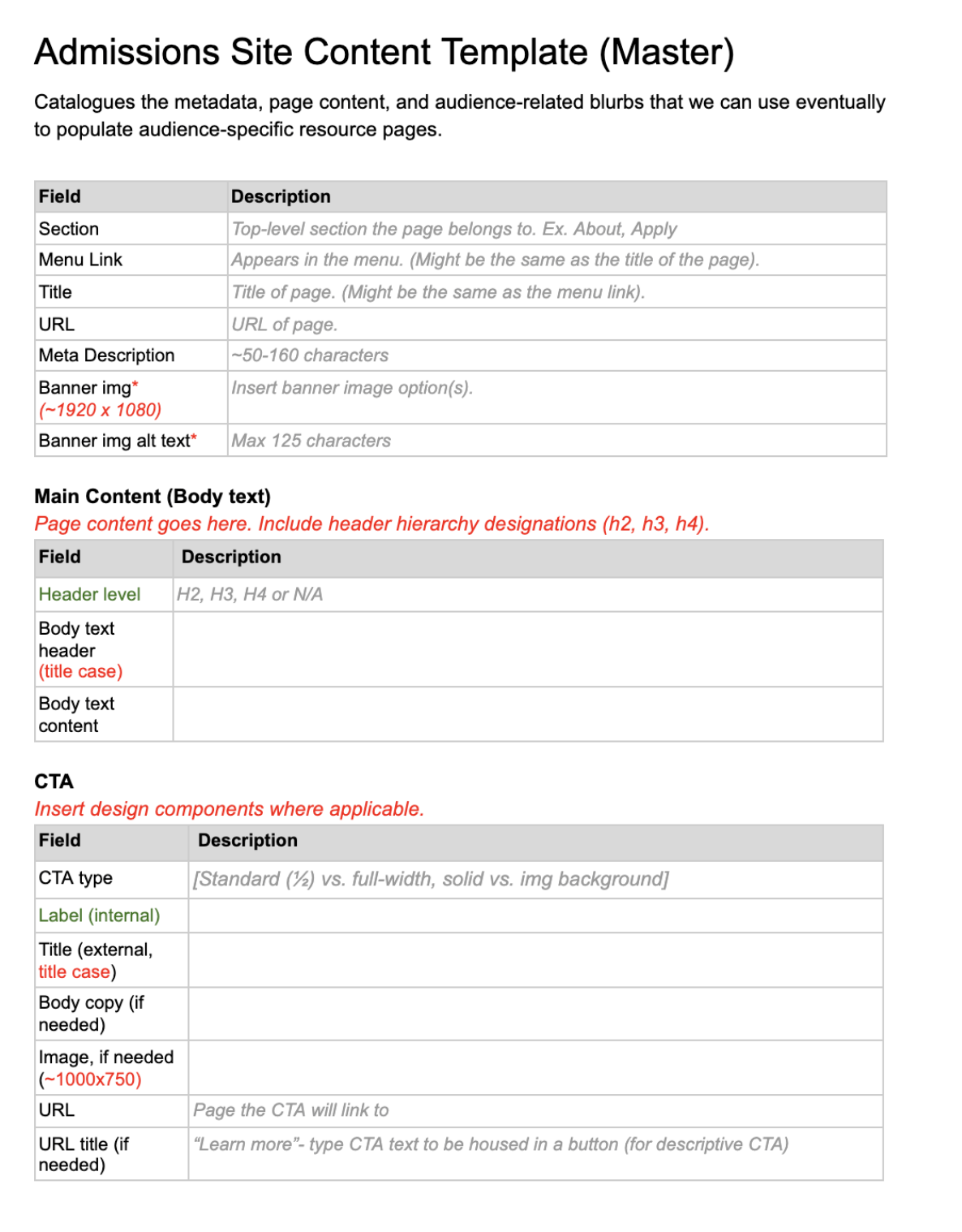
Previously, our team often built content directly in the content management system (CMS). For this project I took the lead on creating a page-level content template to both help bring more consistency to the pages and serve as a learning tool for folks who were less familiar with Drupal. It was designed to reflect the custom components, down to the field level, that could be used to build pages in the CMS. I created one for each page in the site map, and organized them numerically (outline-style) in a Google Drive folder structure so that they could be accessed by everyone on the team.
With the overall structure of the site laid out, I began developing content models for each top-level section. These meatier IA documents allowed me to weave user research insights and audience-oriented information in with the information architecture. The content strategy team added branded messaging points to the document too. We used this document as a reference for presentations to the Admissions leadership team.
Creating these models was a tactile way for the UX and content development teams to work more closely together and sort through the structure of the site. In the past workflows on this site, the teams were more siloed.

Step 5: Homepage research and design
This was the last part of the build process, and we did an extra usability study. This was also a chance to fully align the site’s design and content with a new style guide specific to undergraduate enrollment.
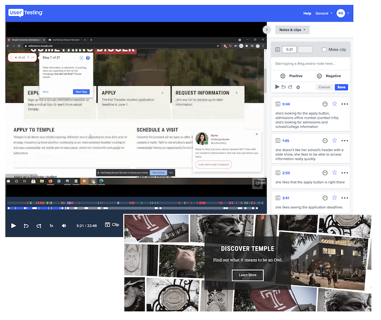
Qualitative insights from UserTesting
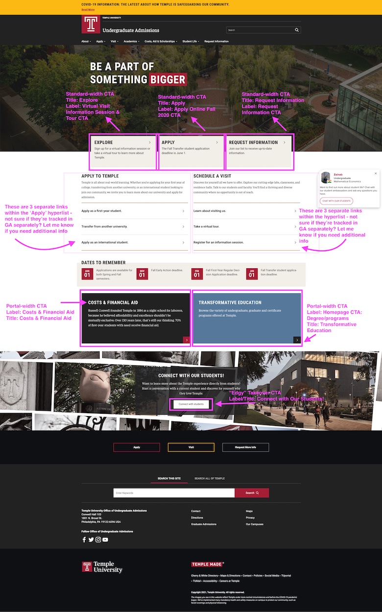
Usability testing allowed us to gather some data on what elements people liked and disliked on the current homepage. As a result of this research we learned what was missing for them (location information, testimonials from students, vibrant imagery, a “Why Temple” statement).
We also validated some design decisions that had been questioned along the way, including a collage pattern background for a call-to-action (CTA) and the eggshell color of the main CTAs on the page. We were able to share user feedback with the client and project team to provide support for the design choices.
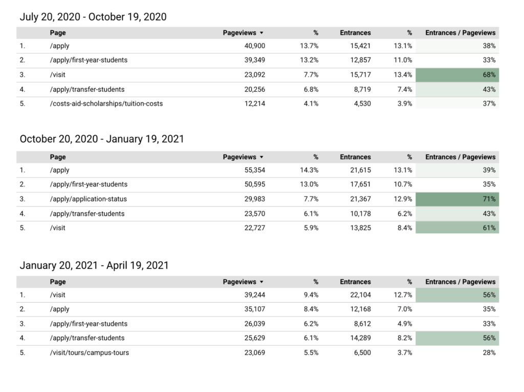
Quantitative insights from Google Analytics
Working closely with the analytics team, we analyzed some user behavior on the site and used a few engagement metrics to make decisions about content to make accessible from the homepage.
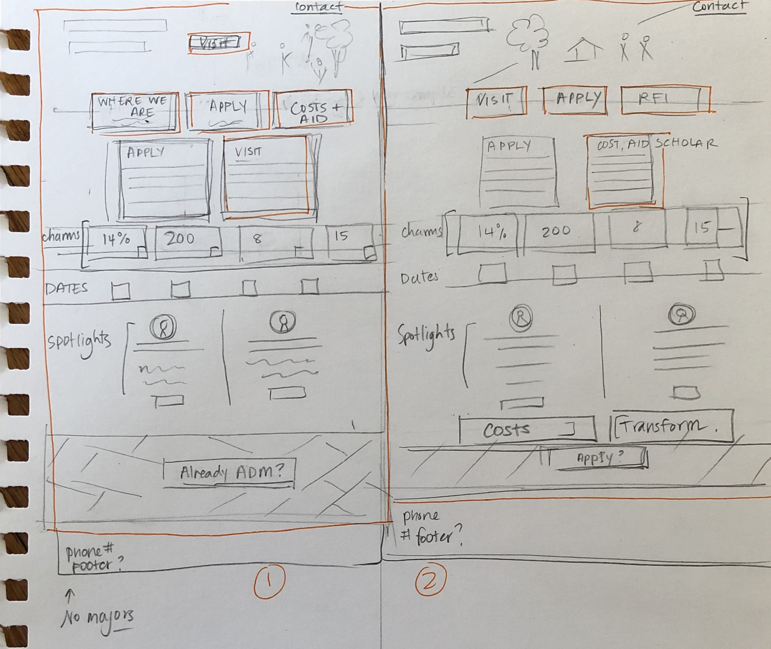
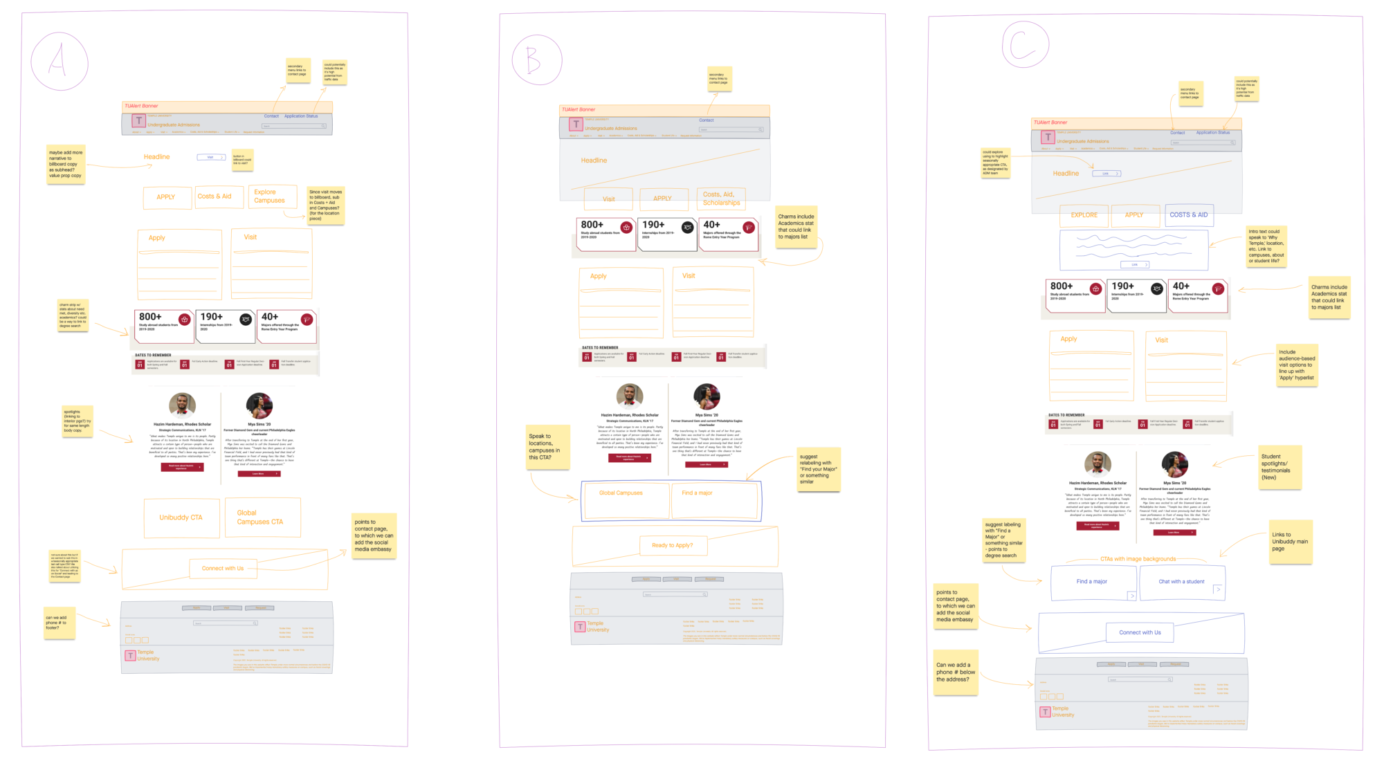
Wireframes
I created several basic wireframe options for the homepage design based on the research, reviewing these with the rest of the team and the client to decide on a direction.
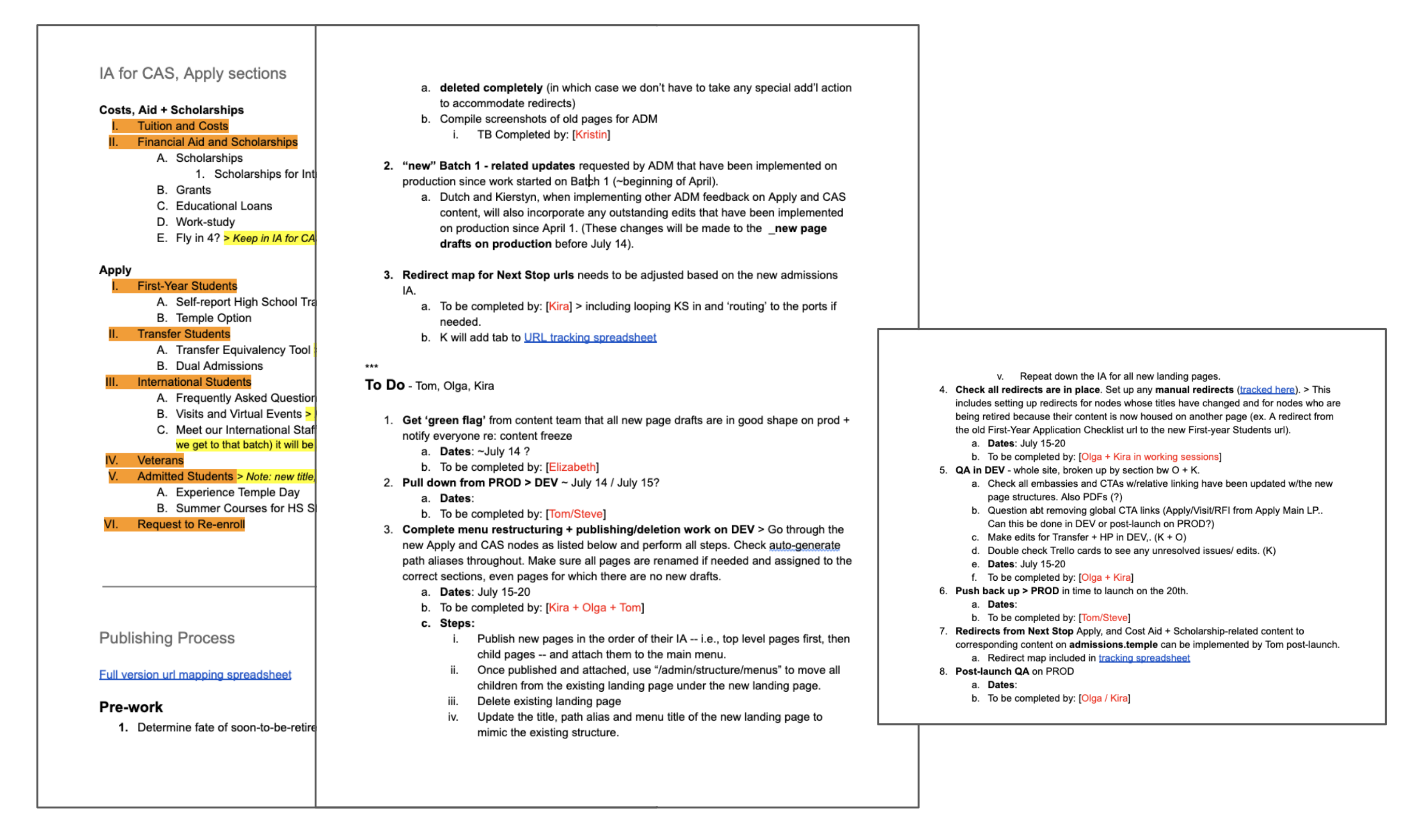
Step 6: Technical support: Content publishing
One of the complexities of this project was content publishing. Because of how long the project was going to take (updates in stages over the course of a year) and how frequently the live admissions site has to be updated, the content team was building and reviewing new content in drafts on the live site, rather than the normal process of working in a development environment.
This process turned out to be quite complex, and was new for all of us. Working closely with the development and QA teams, I put together a plan for publishing each section so we could document all the steps, make sure we all knew what was happening when, and who was responsible for what. I also consulted on redirects to implement in cases where the IA had changed significantly, and kept a spreadsheet for reference.
Step 7: Results: SEO and Analytics
One way of measuring the success of the project was to see how effectively we had been able to transfer a stable of page 1 keywords to the new site from an older property we’d retired. Working with our data science partner we were able to see that this “search equity” had been transferred successfully (see below). This supported our hope that we were supplying answers to key user needs and questions with the new content.
Organic traffic growth
The preliminary analytics data post-launch also showed encouraging growth.
- +86% growth in pageviews to Cost, Aid, Scholarship content
- +65% pageviews to Academics content
- +40% pageviews to Student Life content
- +14% pageviews to About Temple content
Regular reporting cadence
I and a group of analytics, UX and content team members set up a process to report on the performance of the site at a regular cadence, and be able to make iterative improvements based on this data going forward.
