In my role as a UX researcher, I got interested in the experience of how easy or difficult it was to navigate through different Temple University web properties on both mobile and desktop. I ran several studies, all asking the basic question: where are the pain points in the user experience, and how can we improve them?
Framing Document
This kind of comprehensive study hadn’t been done before, and one challenge was that the takeaways became overwhelming. As a team, we tried to break them into bite-sized chunks to tackle iteratively. I made this document to organize the main themes and action items from the body of wayfinding research the team was working through. It encapsulates findings from individual studies including:
- A study on mobile navigation
- A usability test on the degree search tool
- Content testing insights
- Multisite testing (details below)
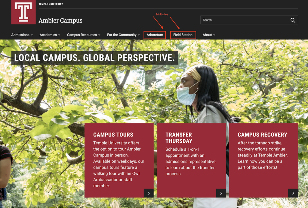
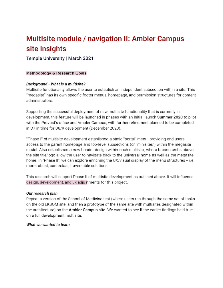
Multisite module testing
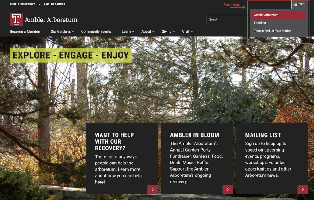
One aspect of our wayfinding research was looking at a new piece of functionality that could allow website admins to navigate between sub-sites. This was particularly useful for schools and colleges that housed independent centers or departments. Our development team built a working prototype for a “multisite” module. We wanted to do some usability testing to help formulate the design and refine the functionality of the module. We performed two tests—one with a Figma prototype, and the other within the development environment. I worked as the research lead and collaborated with my team on design and development decisions.
- Team: Developers, visual designer, researchers, web content team
Research Insights
The resulting research was very interesting in challenging our assumptions; we came in assuming that the “portal menu,” a new menu allowing users to toggle between sub-sites, would be heavily used. Our research showed us that people didn’t naturally see the portal menu, but instead went straight to the breadcrumbs (the more simple, less technologically-sophisticated part of the solution). We gleaned from the research that, though the portal menu was appreciated as an “escape hatch,” the simpler solution we’d seen as a supplement was really the main need for the user.
Beyond this, we got some good pointers on icon size, color and position as well as interaction design of the menus.
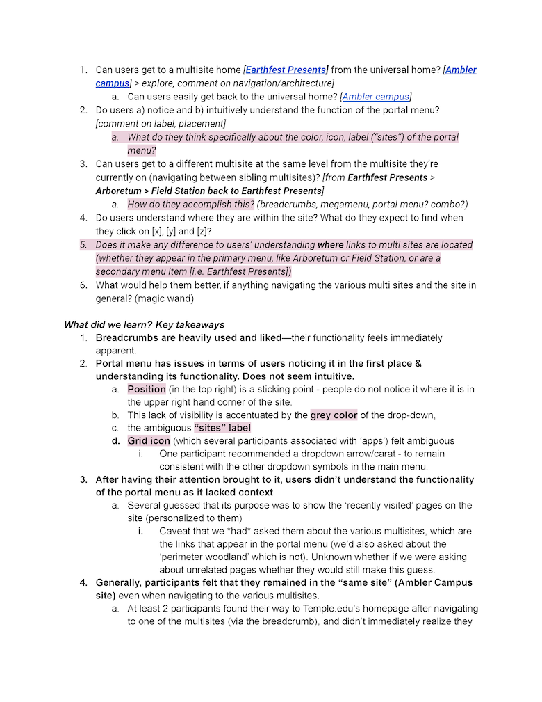
Multisite Admin usability research: As well as testing the website-user experience, we also gathered research on the content administrator experience. I attended in-person discovery sessions with the web developers using the product to take notes for improving the usability of the system from their point of view.