My team was charged with rebuilding the Temple School of Dentistry’s legacy site within a new Drupal framework. We needed to rework the website’s content, design and structure of the site within the updated content management system. All of the work was to be done in collaboration with the school’s faculty experts.
- My roles: UX research, information architecture, content strategy
- The team: Project and partnership manager, stakeholders (School of Dentistry dean + faculty), in-house developer, visual designer, UX and content producers.
Research Inputs
We were working with several inputs—an old sitemap from a data science vendor, interviews with faculty experts, quantitative survey results, competitive research and the existing website’s content, much of it outdated. We were also looking at the school’s individualized brand work to help inform the site structure. The new site needed to encompass the needs of several audiences—not only prospective and current graduate students and faculty, but also dentistry clinic patients and North Philadelphia community members, who were not otherwise associated with the university.
Information Architecture
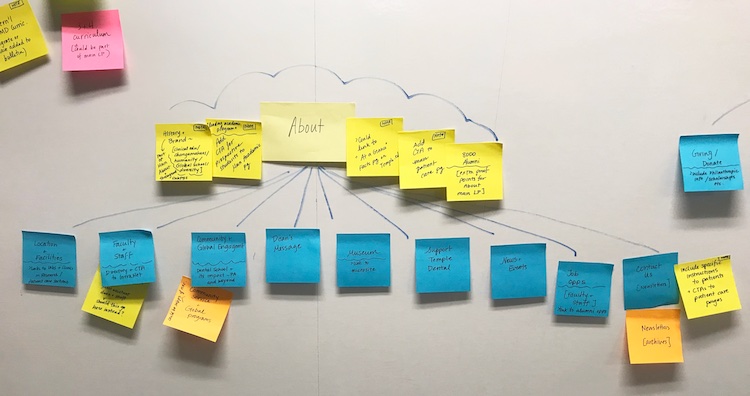
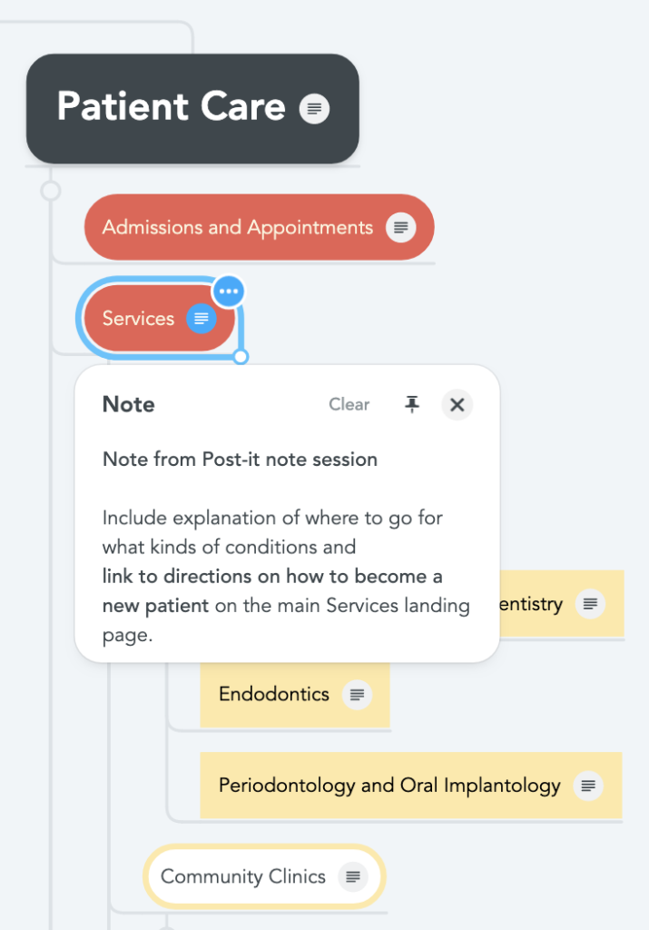
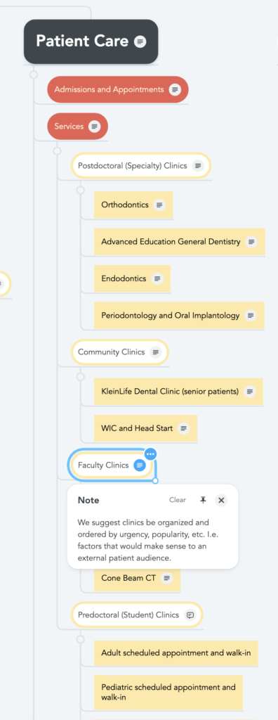
One core task was creating an updated information architecture (IA) document to present the site’s concept to leadership and serve as a grounding document for our content and development teams. I facilitated a mapping session with the team to create a post-it version, and then translated this document to an interactive mind map (bottom image), which was annotated and evolved throughout the project.
Patient care section: UX + content design
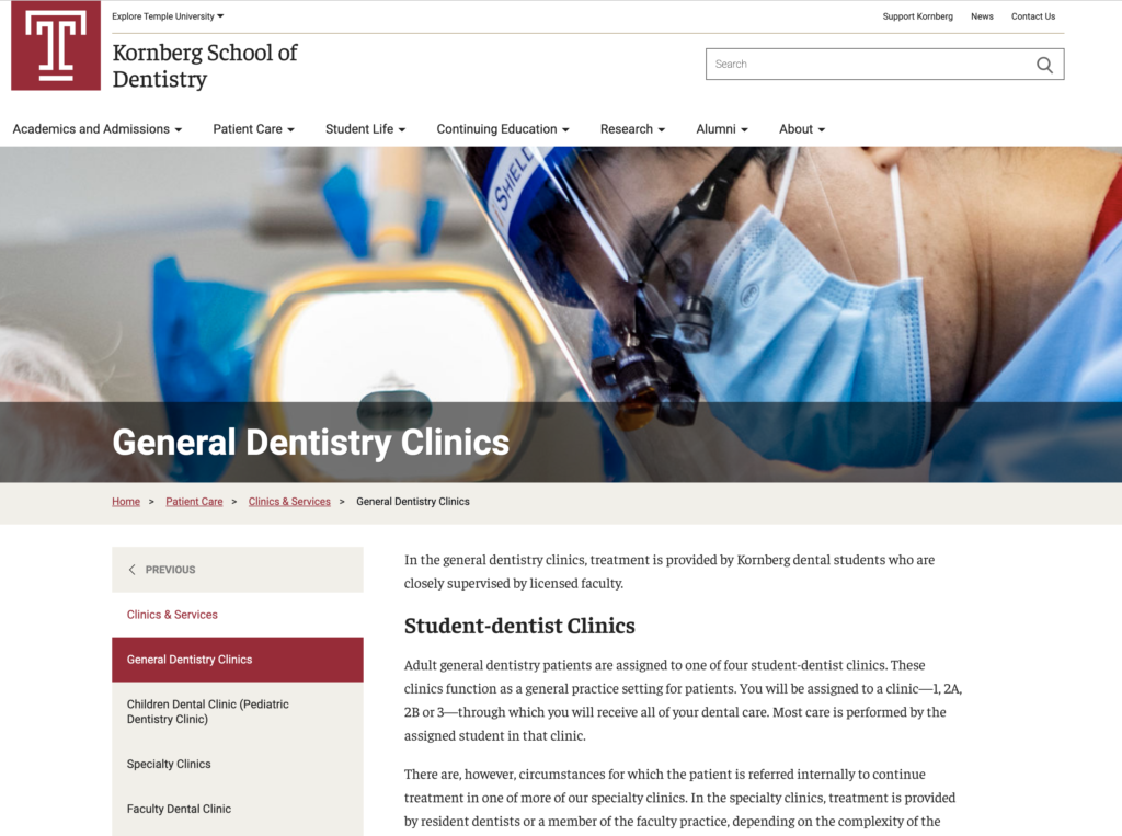
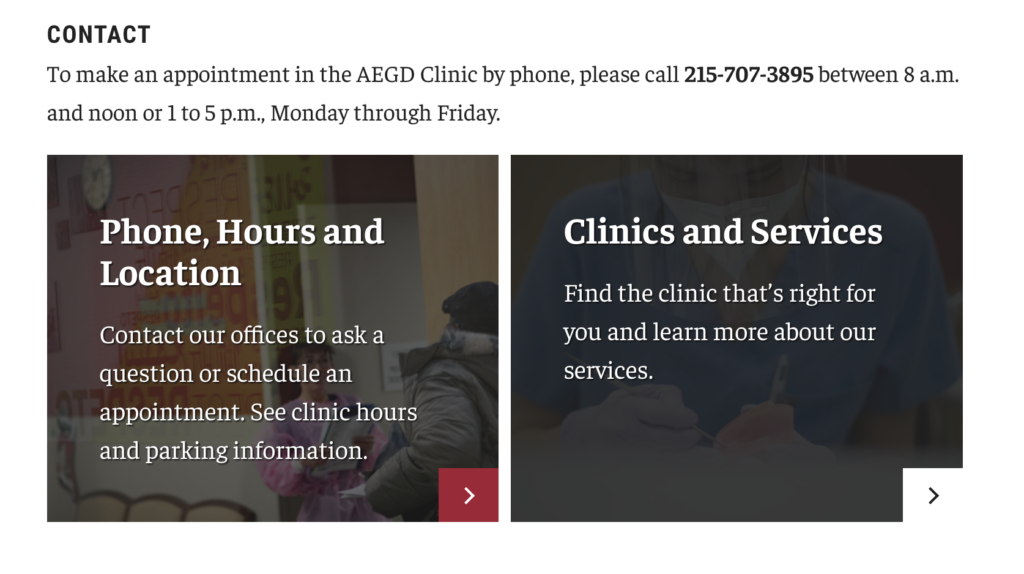
One key part of the project was designing a section for current and potential patients of the school’s dentistry clinic: the Patient Care section. Working with a member of the web content team, I talked to faculty experts and assessed the data we had from patient surveys, sketching out how the patient care content could be designed to suit the needs of current patients and community members.
Navigation
Navigation and wayfinding were top-of-mind. We wanted to understand the patients’ mindset and information needs so that we could make the best design decisions, placing visually appealing calls-to-action to key sections and pages. One challenge we encountered was that the dental faculty’s vision of how the site should be organized often mirrored their internal organization and how they thought about the importance of the clinics based on complexity of care, prominence of research or teaching faculty, etc. By contrast, we were trying to look at the organization of the site from a user’s standpoint. We thought about organization based on user needs like popularity of clinics or most accessible hours. This took a lot of conversation with the client to compromise on a structure that met user needs as well as some institutional ones.
Imagery
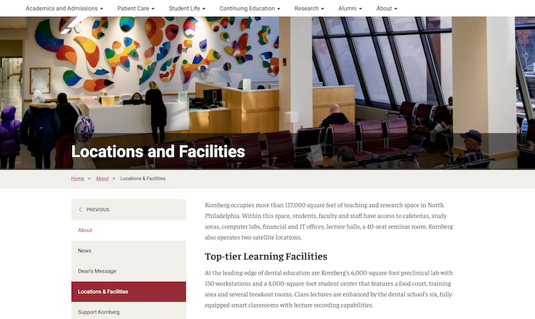
We also worked to find imagery that was welcoming and fit the brand of the school. One difficulty with this was that privacy concerns made it impossible to show imagery with people from the dental clinic. As an alternative, we tried to show the spaces where patients would be welcomed and clinic staff in candid poses.
Revisions and feedback
This was a key section to get buy-in from the school’s leadership, so we went through many rounds of revision. Once a portion was complete, we went through a round of on-screen reviews to get their thoughts and feedback. This process was repeated throughout, with myself and my team articulating the UX best practices and research behind our decisions.
Homepage design
This was a collaboration with the data science vendor—they provided some specs for SEO, which we (the UX + content teams) translated into framework components and designed the homepage. Our team, led by our visual designer, came up with styling for the design elements (calls-to-action, billboard framing, typography) based on the school’s individual branding.

