I figured out one of the ways I could intuitively contribute to projects was sketching or concept-mapping to make concepts that were discussed or mentioned in meetings more tangible. Looking at these artifacts let the group see what had been done so far so we everyone could get on the same page and make progress towards our goals.
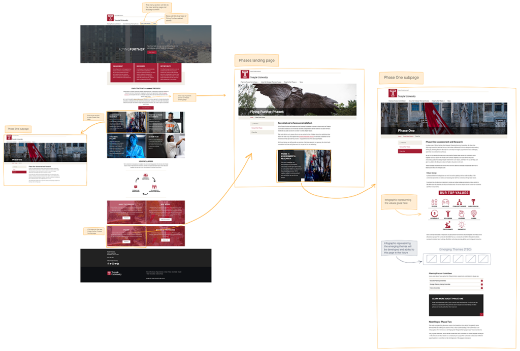
User flow diagrams
I create these to help the team or clients visualize how a web experience will work for the user.
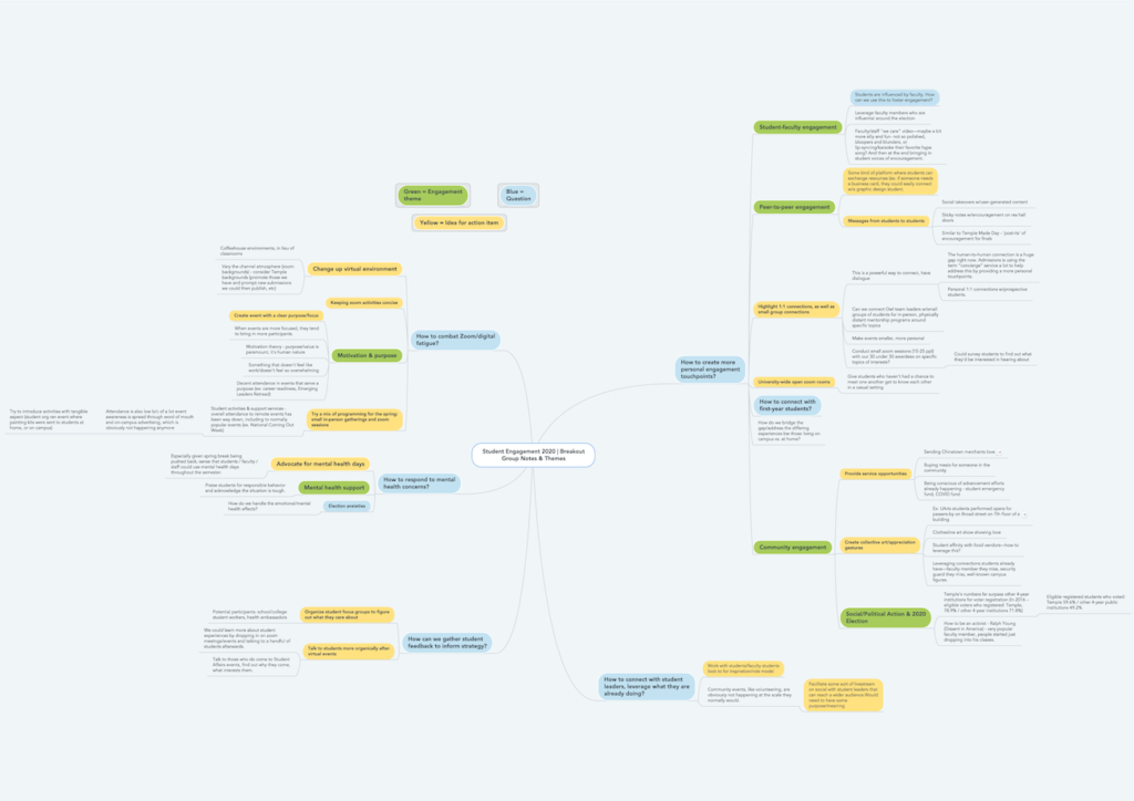
Student engagement discussion map
I participated in a group conversation about student engagement. Everyone from the meeting submitted their notes, and I was asked to compile and share them back to the group.
I created this diagram to map out common themes, and pull out key topics and connections. I presented the visual to the group and helped facilitate further conversation and action items to improve the student experience.
Class of 2020 – Virtual commencement site
Our department was tasked with creating a digital experience to substitute for an in-person commencement in 2020. This was a challenging time for the marketing team in general as we transitioned from being fully in-person to fully remote.
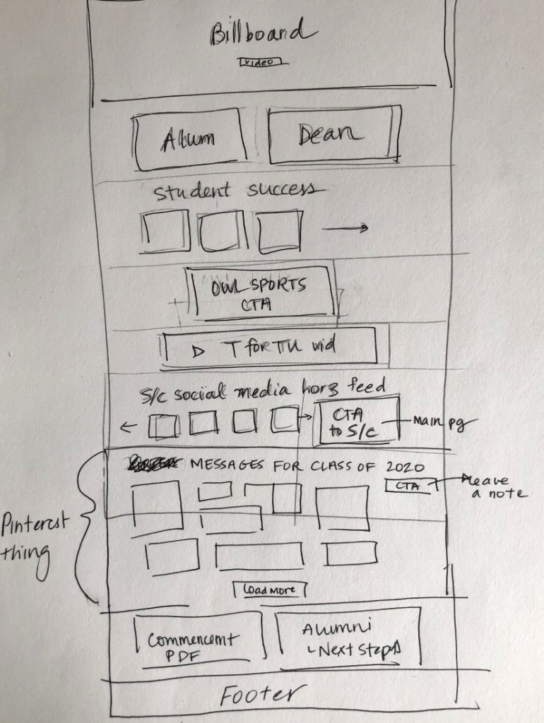
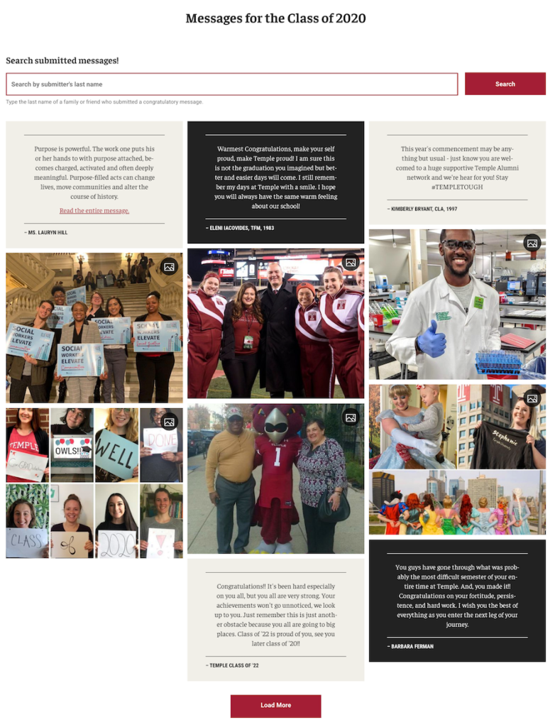
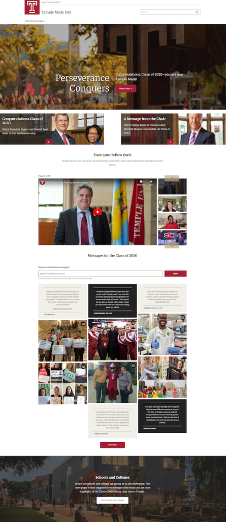
The project in particular was exciting and also challenging, since we wanted to produce something meaningful and our timeline was compressed. We wanted to create a user-generated content module, so that graduates’ loved ones could leave messages for them in addition to a virtual commencement. I worked collaboratively with content, development and design team members to imagine and build this project. Below is a rough sketch I made of the homepage to help ground early design conversations, and the final product of the masonry-style user-generated content block built by the dev team.
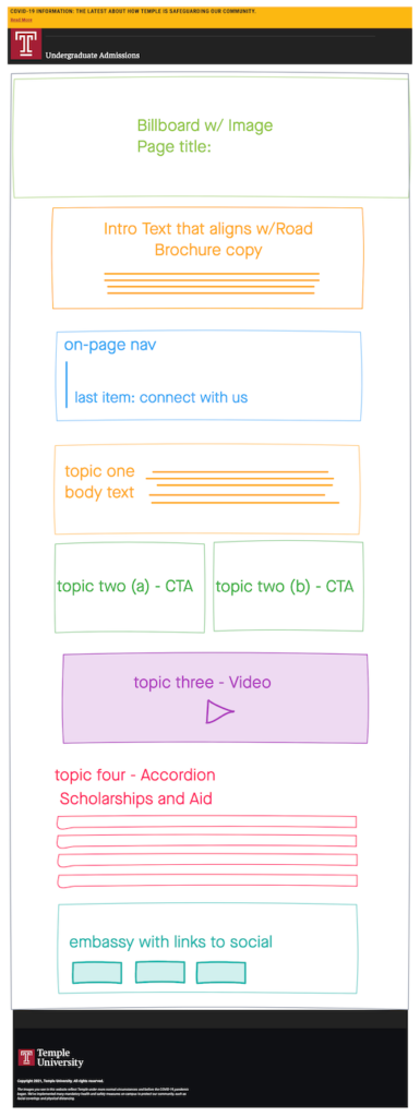
Freehand wireframes
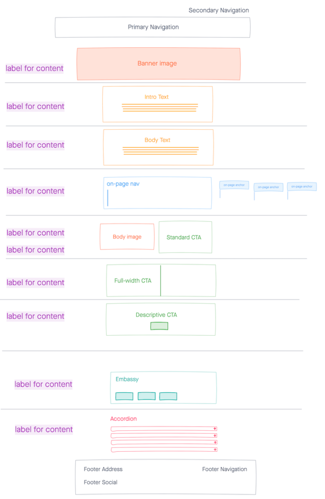
When I joined the UX team, I did a lot of paper prototyping and sketching, but our team didn’t have a good solution for quick low-fidelity digital wireframes—something between pen/paper and a full mockup in Sketch or InVision. Our director introduced InVision Freehand, for the team to explore. I created a library of components that could be used to build wireframes, and used it to build simple page layouts for various projects.

President website
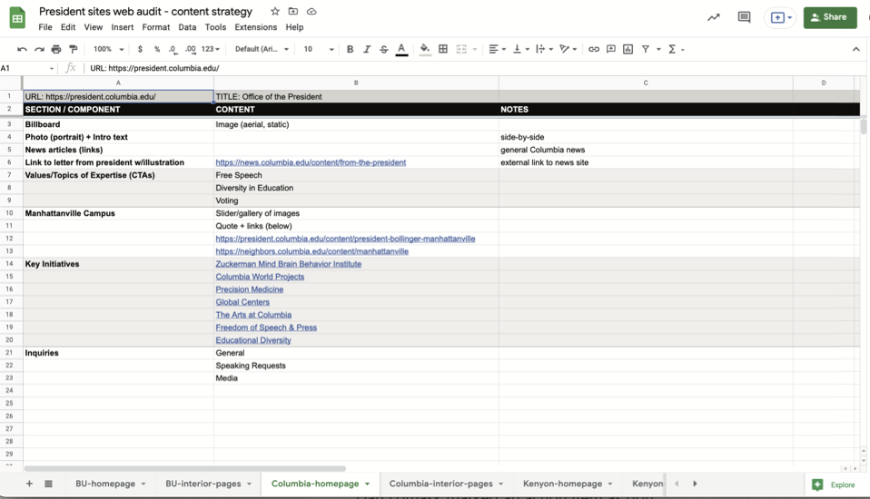
My team was asked to create a website devoted to Temple’s new president. We started by researching presidents’ websites at other universities, and created a spreadsheet auditing our observations on content, design, navigation and functionality. I focused on the visual aspect, looking at which design components were chosen to present which content, and what aesthetic choices were made throughout the competitor sites. I also looked at categories and section labels to get ideas for our own information architecture.
Information architecture

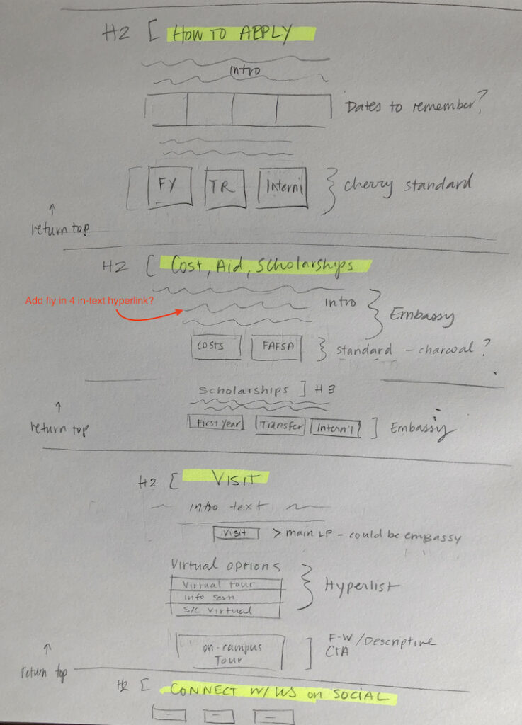
From this research, I created a proposed information architecture, collaborating closely with a colleague on the content team. We asked for feedback from department leadership and the office of the president, and adjusted the structure accordingly.
Homepage design
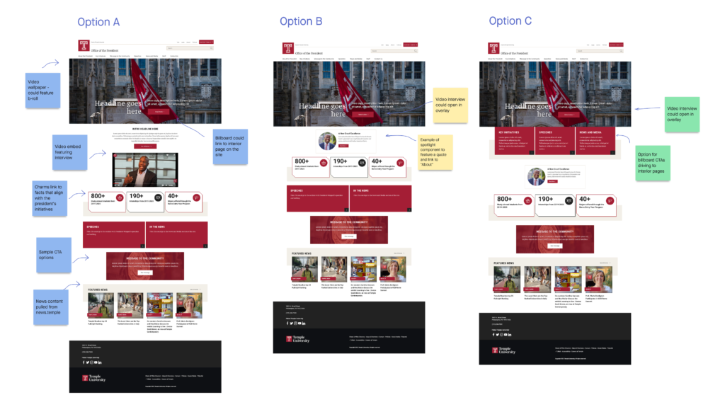
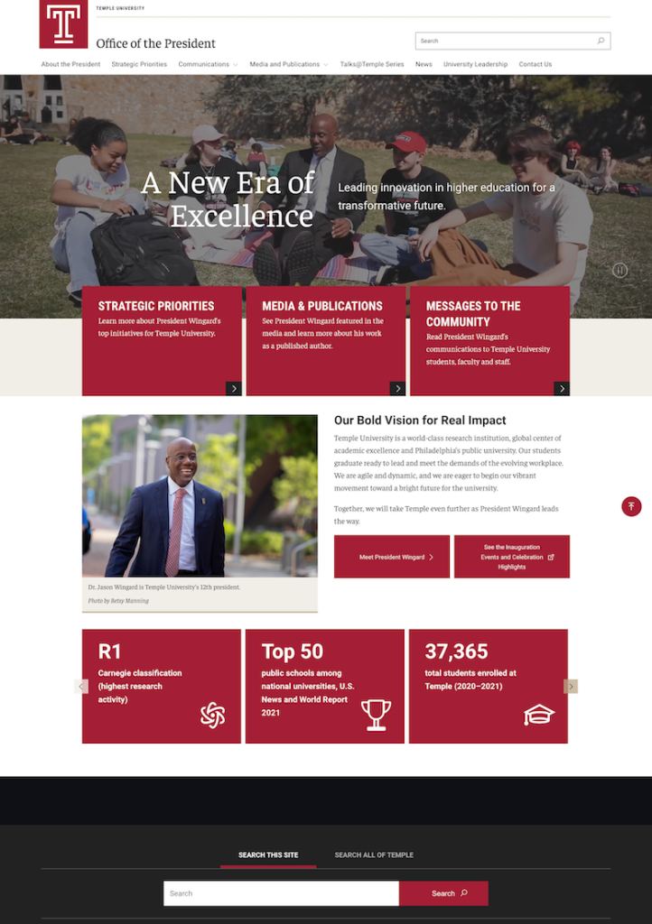
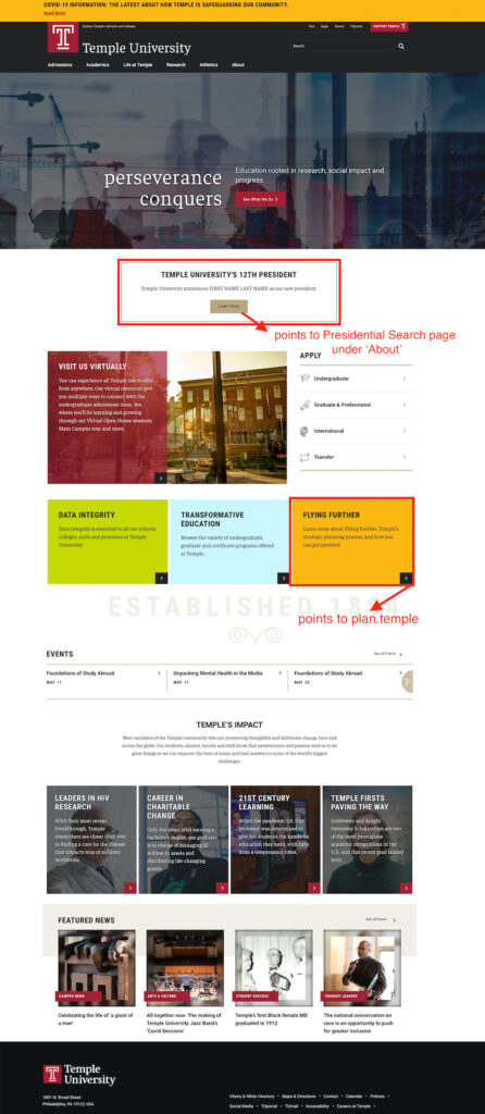
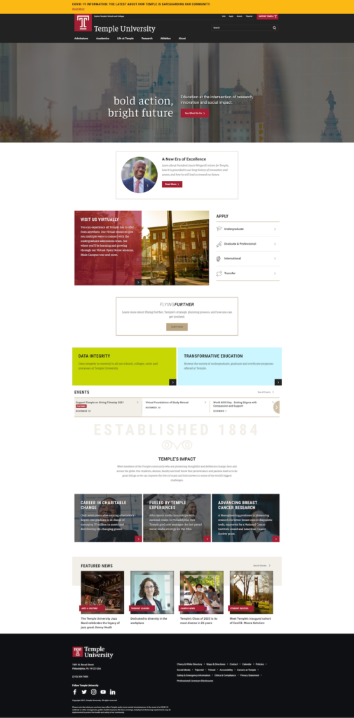
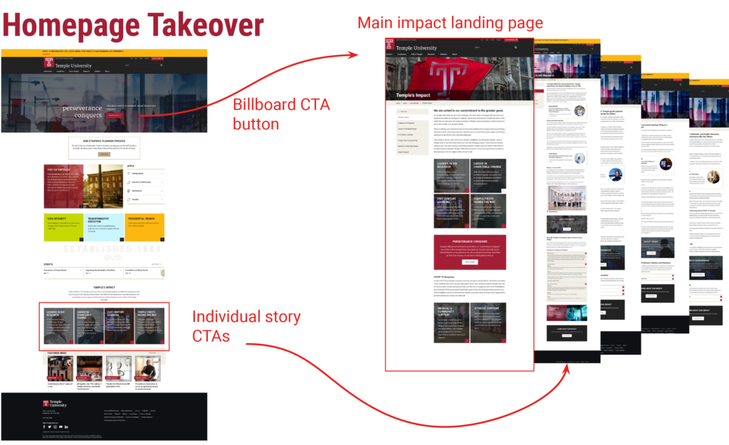
While other members of the team were working on content for the site, we moved on to visualizing the homepage and getting feedback. Using our sketch library and Adobe XD, I created a few basic mockups of the homepage, and then presented an annotated selection using Invision Freehand. We used this to get feedback and build the finished site. Our team also worked on a linking strategy between the main Temple.edu site and the new site. I created mockups to show our proposal for this as well.
