I came into UX with a baseline understanding of Google Analytics. I was fortunate to work with several coworkers and vendors with a deep understanding of SEO, google analytics and quantitative research methodologies. We worked on large perception studies, surveys and quantitative methods for analyzing and optimizing web content.
I was often in rooms where I was among the, if not the least technically knowledgable person in IT, web development, systems infrastructure or SEO. One thing I found I could contribute in these situations was asking basic questions to bring the conversation out of the weeds at regular intervals. Once I got a handle on basic concepts, I could work on interpreting the data and telling a more accessible story. It was a great challenge to figure out how to visualize and present a story that would make the data useful to more people.
- Team: Data analyst, web analyst, and myself partnering with our data science vendor. We also worked closely with the in-house Drupal development team and the information technology services department.
- My contribution: Design + visualization, research, writing
User Journey research
I was part of a cross-functional team (marketing, data science, development) who began mapping user journeys for specific advertising campaigns targeting prospective students to Temple. Examples included awareness-building campaigns as well as those encouraging prospective students to apply or submit an admissions deposit.
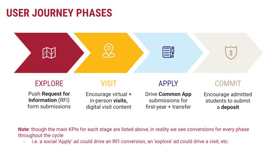
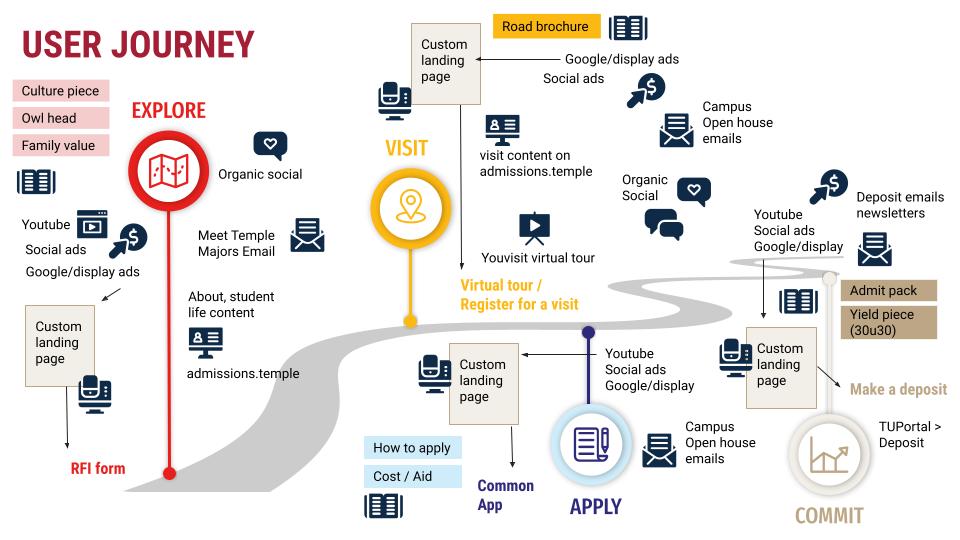

This was an exciting project, since the technology being used to chart these journeys was new. Our ultimate goal was to link marketing campaign efforts to overall return on investment, seeing which patterns led to “conversions” (filling out a request for information form, submitting a deposit, etc). We hoped to improve the user experience within these journeys, and track our efforts year-over-year against departmental/strategic goals.
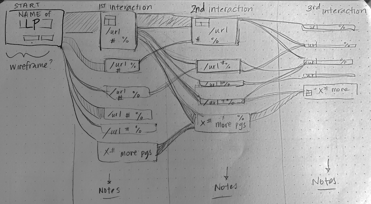
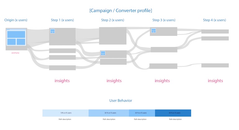
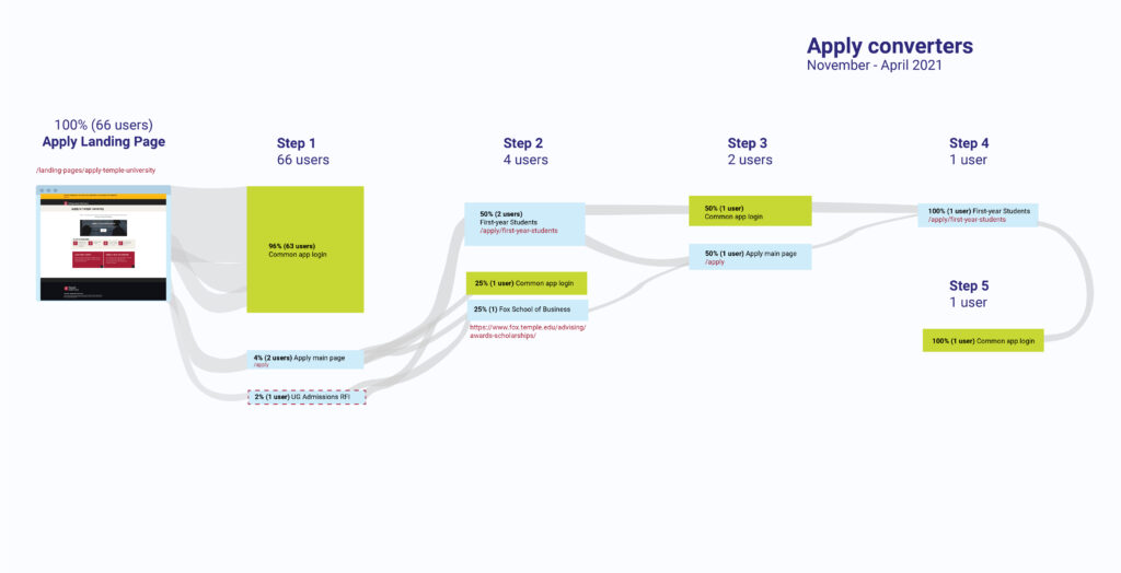
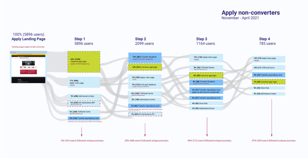
My role was to visualize the raw journey data (aggregated URL path sequences, as seen to the left) so that we could see patterns in user behavior as well as uncover friction within the user experience. These visuals also helped to explain the project to leadership and university stakeholders.
Reporting
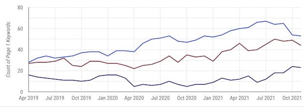
I worked with our data science vendors and web analyst on larger-scale content analysis of the university’s web properties, enterprise analytics reporting, SEO, comparative analytics and strategies for individual websites. My job was to help translate more technical information where necessary for stakeholders, including leadership as well as marketing team members in order to figure out how to implement the findings.
I also collaborated with our internal analytics team to pilot and refine quarterly reports for campus-wide clients, reporting on how their sites were performing and how to improve them. Before, university partners got analytics reports, but we had little indication if anyone looked at them. We wanted to make the data more immediate and meaningful so that people would actually look at it and use it.
One of our main challenges: presenting fluctuations or a dip in traffic/engagement as an opportunity for improvement, rather than purely negative. If a client sees a website as a static, finished product, analytics reporting and insight becomes a judgment of how well that static product performs. It was a challenge to communicate the flexible nature of web, and the fact that even if research and data has gray areas or several potential interpretations, it is still extremely useful in suggesting future optimization and experimentation. We found that presenting the data as part of a story helped.
Assessment
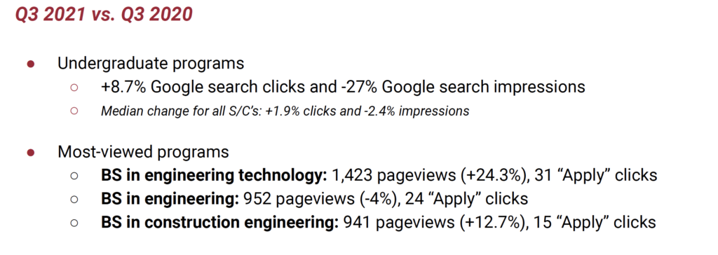
As Assistant Director of UX I stepped into a role helping to regularly justify and report on the digital work that the marketing team did, for accreditation organizations like Middle States as well as internal university budgeting needs. Our reporting helped quantify return on investment for our marketing and communications efforts, and tie analytics findings to creative strategy. It was a great learning experience to work together with analysts and marketers to tell the story of what we were doing and why, how it could be improved, and what we could learn from the process.
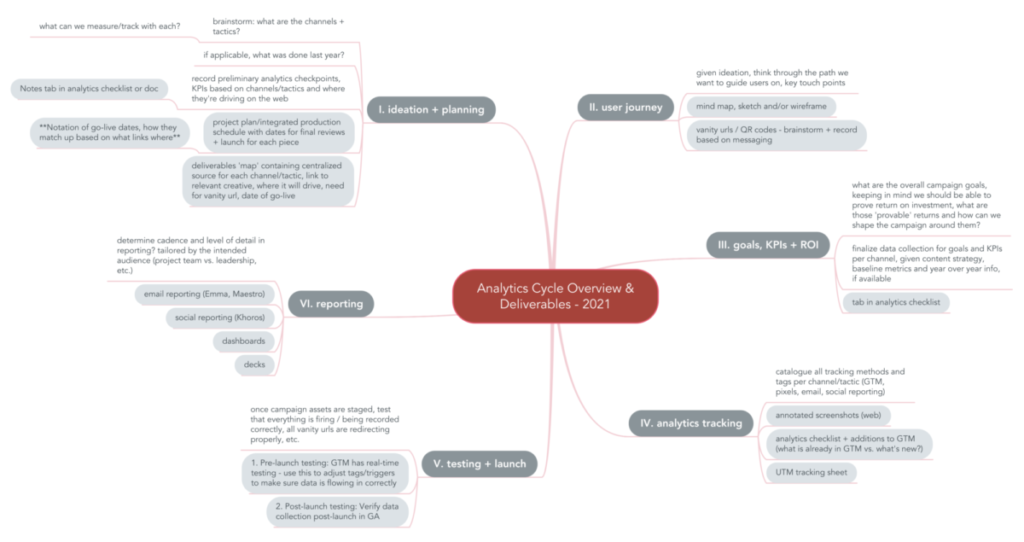
Part of this process involved aligning on which analytics data was being collected when across the department. Previously this process had been more siloed, with team members gathering analytics individually by channel, but no one having the full picture. I worked with the team to visualize a more holistic approach.